Schedoni Modena — Italian Leathercraft E-Commerce
Role
Lead Product Designer
Mode
Sole Ownership via Texture
Scope
E-Commerce Redesign
UX Architecture
High-Fidelity UI
Design System
Timeline
Aug 2025 — Nov 2025
Figma
Live
Overview
Schedoni Modena has been making leather goods since 1880, with bags priced up to €12,000. The brand had a complete world around it — Modena workshop, Italian leather craft, automotive heritage, a quiet image-led sense of luxury
The old site carried that world. Long video intro, heavy animation, no real catalog — a brand film you couldn't shop from. Prices and details sat behind a slide-out panel
The brief from the founders was straightforward: keep the prestige, add the commerce. The hard part is that these two pull in opposite directions
Browsing & Catalogue
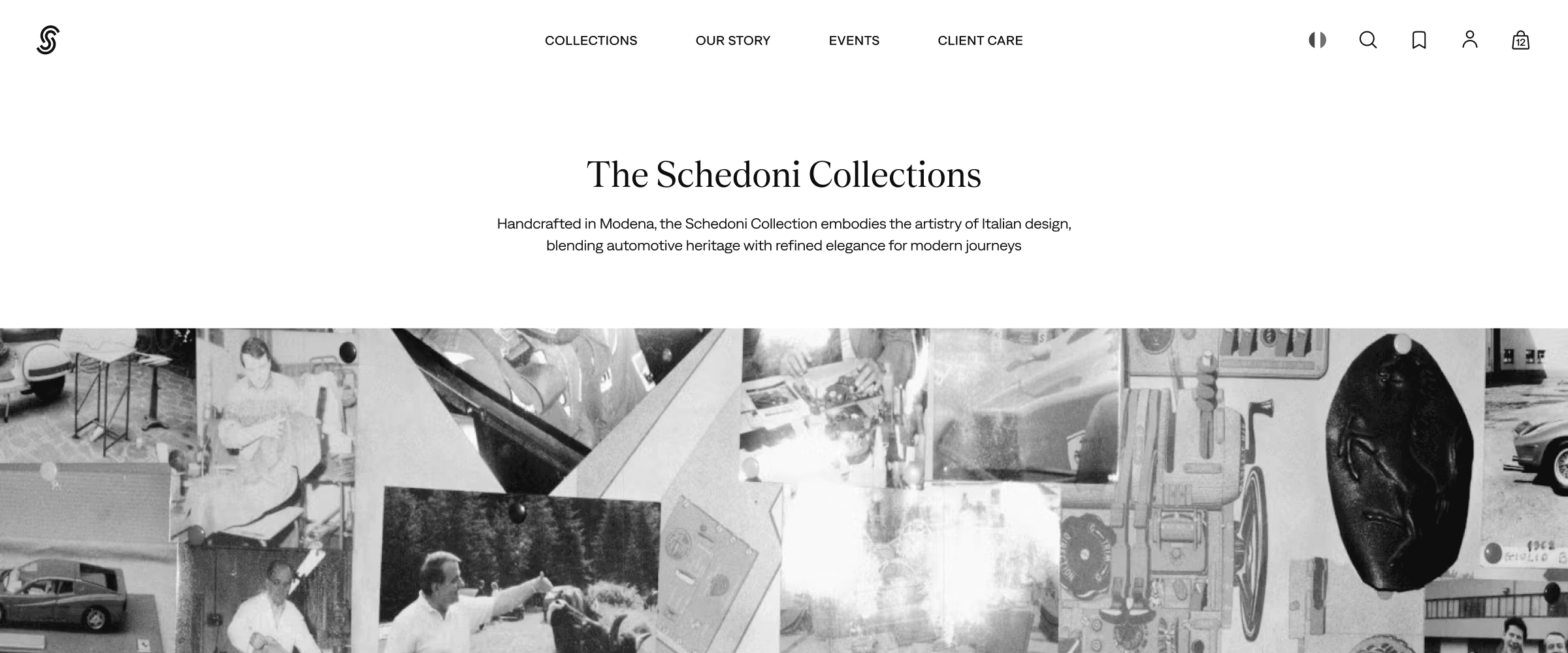
Navigation was rebuilt so shopping, brand, service, and utility actions each have a clear place. Collections are easier to reach, while search, wishlist, cart, and country/currency controls stay available without competing with the main navigation
The catalog stayed intentionally simple. With a small product range, deep filters and complex merchandising would have added more interface than value. The collection page uses a clean grid, simple filters and sorting, and colour swatches that swap the product image on hover — enough structure to browse and compare colours without making the site feel bigger than the catalog
Rebuilding the PDP
The product page carried the main change. The previous PDP gave the gallery a full-bleed slot and pushed price, colour, and specs behind a slide-out panel — impressive, unusable
The new layout keeps photography and purchase controls side by side: image, title, price, colour swatches, expandable specs, Add to Bag, express payment — all visible without scrolling, without panels. The goal wasn't to invent a new buying pattern, just to make familiar e-commerce behaviour feel natural inside a restrained luxury layout. Storytelling moved lower on the page, where craft, materials, and automotive references can back a buying decision rather than replace one
Utility Flows
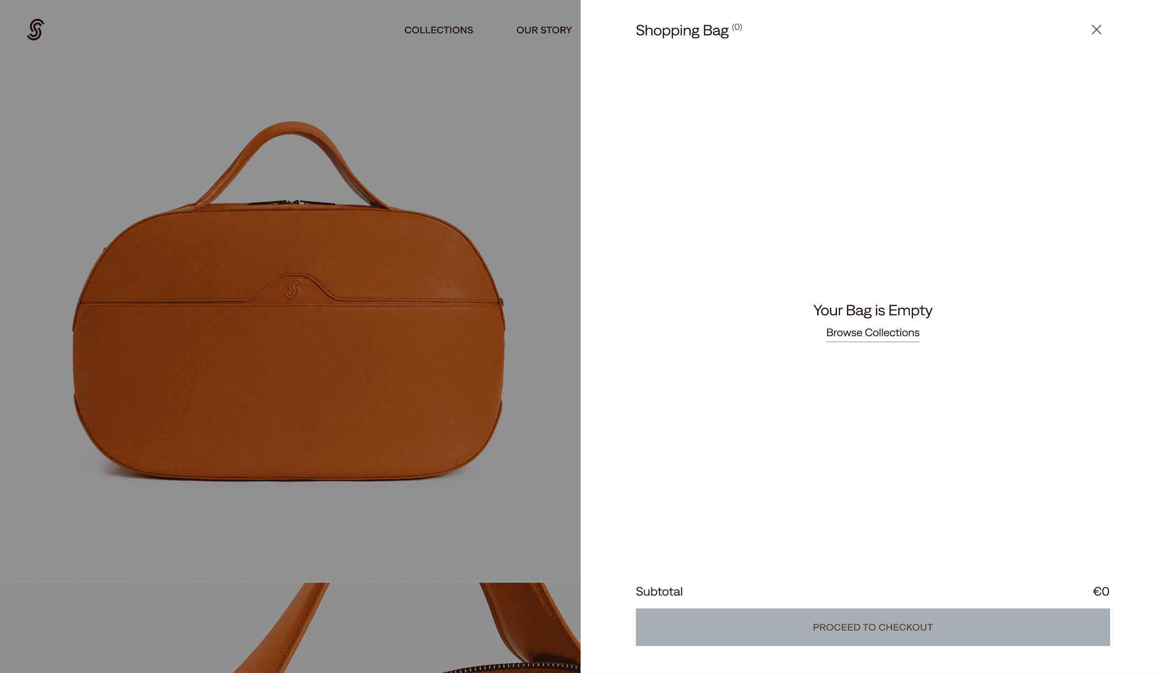
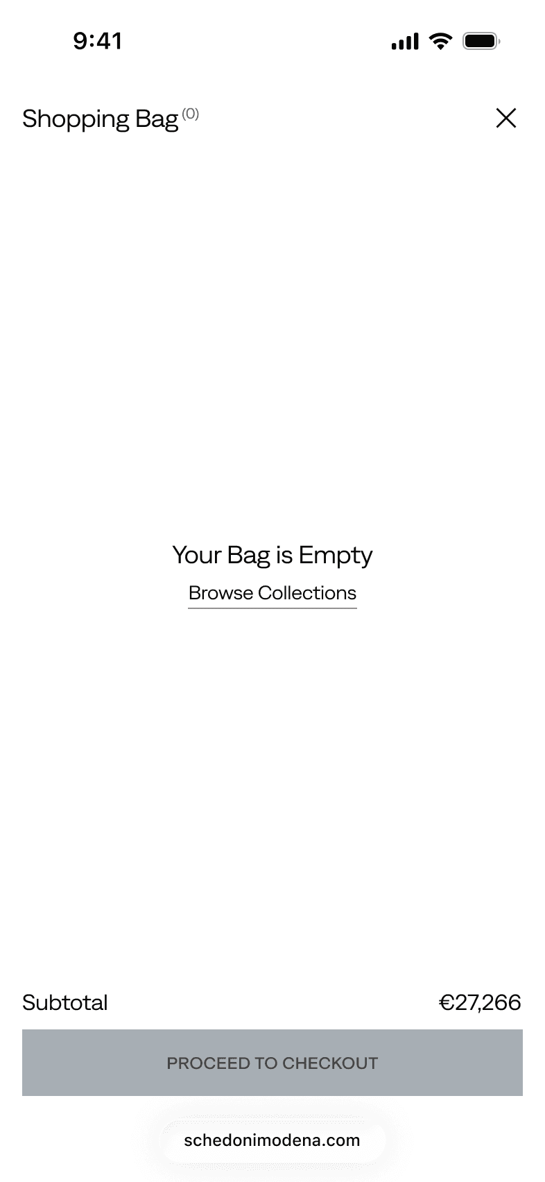
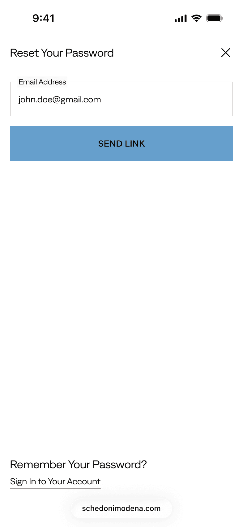
Cart, wishlist, search, account, password reset, country/currency selection, and their related empty and error states share a single drawer pattern across the site. This keeps common actions close to the page the customer is viewing, and gives the build a more consistent structure. None of this is unusual for e-commerce — that was the point. The flows needed to feel expected
Brand Pacing
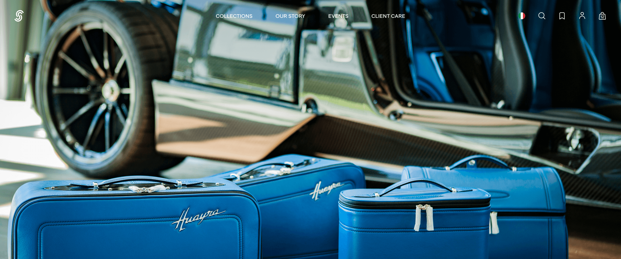
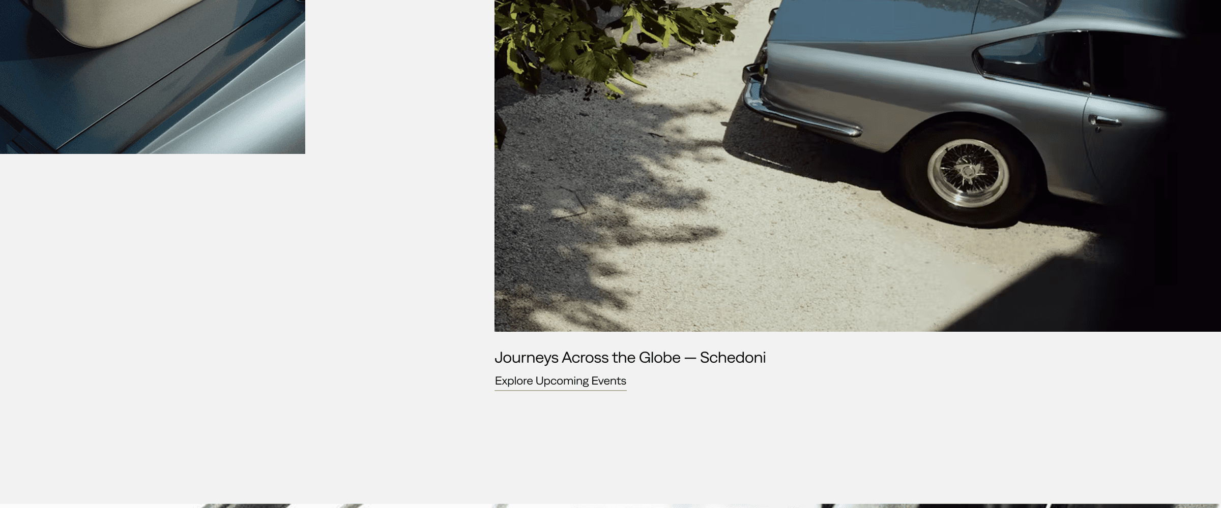
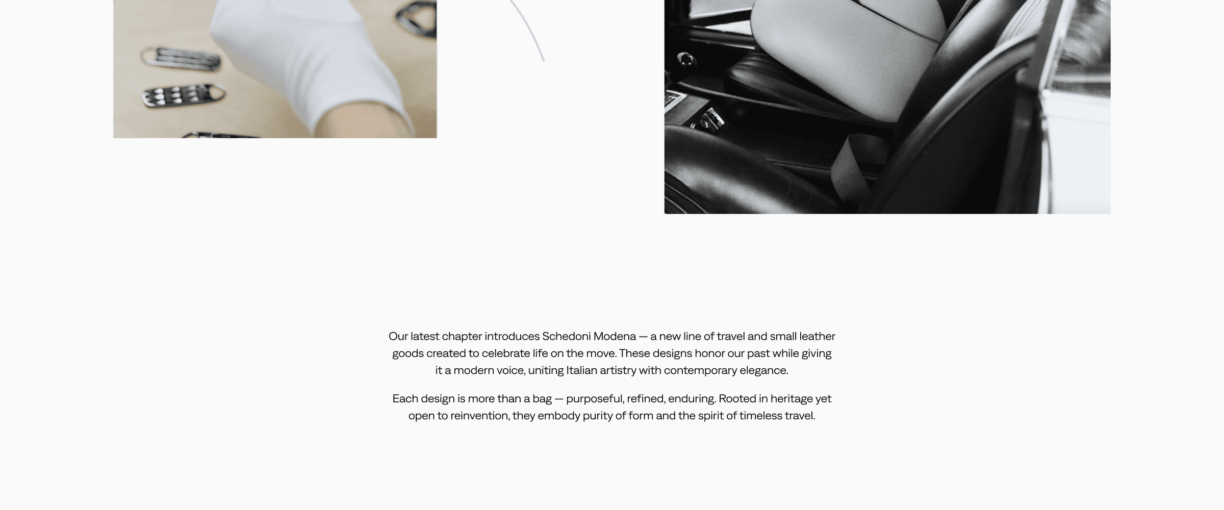
The homepage is paced around product and brand rather than stacked as sales blocks. A visual hero introduces the Schedoni world, followed by new products, collection blocks, workshop imagery, founder quotes, automotive references, and a closing banner. The page sells, but it doesn't treat every section like a promotion
The visual system follows the same direction: reduced animation, off-white and sand surfaces, blue as an accent rather than a base colour, refined typography and link styles
What Changed
The founders went from treating the site as a digital lookbook to running it as their primary sales channel. The brand world is still there — Modena workshop, automotive references, restrained pacing — but no longer the only thing on the page
Nothing feels added; everything feels Schedoni
Schedoni Modena — Italian Leathercraft E-Commerce
Role
Lead Product Designer
Mode
Sole Ownership via Texture
Scope
E-Commerce Redesign
UX Architecture
High-Fidelity UI
Design System
Timeline
Aug 2025 — Nov 2025
Figma
Live
Overview
Schedoni Modena has been making leather goods since 1880, with bags priced up to €12,000. The brand had a complete world around it — Modena workshop, Italian leather craft, automotive heritage, a quiet image-led sense of luxury
The old site carried that world. Long video intro, heavy animation, no real catalog — a brand film you couldn't shop from. Prices and details sat behind a slide-out panel
The brief from the founders was straightforward: keep the prestige, add the commerce. The hard part is that these two pull in opposite directions
Browsing & Catalogue
Navigation was rebuilt so shopping, brand, service, and utility actions each have a clear place. Collections are easier to reach, while search, wishlist, cart, and country/currency controls stay available without competing with the main navigation
The catalog stayed intentionally simple. With a small product range, deep filters and complex merchandising would have added more interface than value. The collection page uses a clean grid, simple filters and sorting, and colour swatches that swap the product image on hover — enough structure to browse and compare colours without making the site feel bigger than the catalog
Rebuilding the PDP
The product page carried the main change. The previous PDP gave the gallery a full-bleed slot and pushed price, colour, and specs behind a slide-out panel — impressive, unusable
The new layout keeps photography and purchase controls side by side: image, title, price, colour swatches, expandable specs, Add to Bag, express payment — all visible without scrolling, without panels. The goal wasn't to invent a new buying pattern, just to make familiar e-commerce behaviour feel natural inside a restrained luxury layout. Storytelling moved lower on the page, where craft, materials, and automotive references can back a buying decision rather than replace one
Utility Flows
Cart, wishlist, search, account, password reset, country/currency selection, and their related empty and error states share a single drawer pattern across the site. This keeps common actions close to the page the customer is viewing, and gives the build a more consistent structure. None of this is unusual for e-commerce — that was the point. The flows needed to feel expected
Brand Pacing
The homepage is paced around product and brand rather than stacked as sales blocks. A visual hero introduces the Schedoni world, followed by new products, collection blocks, workshop imagery, founder quotes, automotive references, and a closing banner. The page sells, but it doesn't treat every section like a promotion
The visual system follows the same direction: reduced animation, off-white and sand surfaces, blue as an accent rather than a base colour, refined typography and link styles
What Changed
The founders went from treating the site as a digital lookbook to running it as their primary sales channel. The brand world is still there — Modena workshop, automotive references, restrained pacing — but no longer the only thing on the page
Nothing feels added; everything feels Schedoni
Schedoni Modena — Italian Leathercraft E-Commerce
Role
Lead Product Designer
Mode
Sole Ownership via Texture
Scope
E-Commerce Redesign
UX Architecture
High-Fidelity UI
Design System
Timeline
Aug 2025 — Nov 2025
Figma
Live
Overview
Schedoni Modena has been making leather goods since 1880, with bags priced up to €12,000. The brand had a complete world around it — Modena workshop, Italian leather craft, automotive heritage, a quiet image-led sense of luxury
The old site carried that world. Long video intro, heavy animation, no real catalog — a brand film you couldn't shop from. Prices and details sat behind a slide-out panel
The brief from the founders was straightforward: keep the prestige, add the commerce. The hard part is that these two pull in opposite directions
Read More
Schedoni Modena — Italian Leathercraft E-Commerce
Role
Lead Product Designer
Mode
Sole Ownership via Texture
Scope
E-Commerce Redesign
UX Architecture
High-Fidelity UI
Design System
Timeline
Aug 2025 — Nov 2025
Figma
Live
Overview
Schedoni Modena has been making leather goods since 1880, with bags priced up to €12,000. The brand had a complete world around it — Modena workshop, Italian leather craft, automotive heritage, a quiet image-led sense of luxury
The old site carried that world. Long video intro, heavy animation, no real catalog — a brand film you couldn't shop from. Prices and details sat behind a slide-out panel
The brief from the founders was straightforward: keep the prestige, add the commerce. The hard part is that these two pull in opposite directions
Read More
Desktop UI
Mobile UI
Desktop UI
Mobile UI
Desktop UI
Mobile UI
Home



Collections Menu

Collections


Product Detail


Wishlist Drawer


Bag Drawer

Our Story




Events


Account Drawer


My Account


Country & Currency Drawer


Search Drawer


Client Care


Home


Collections Menu


Collections

Product Detail


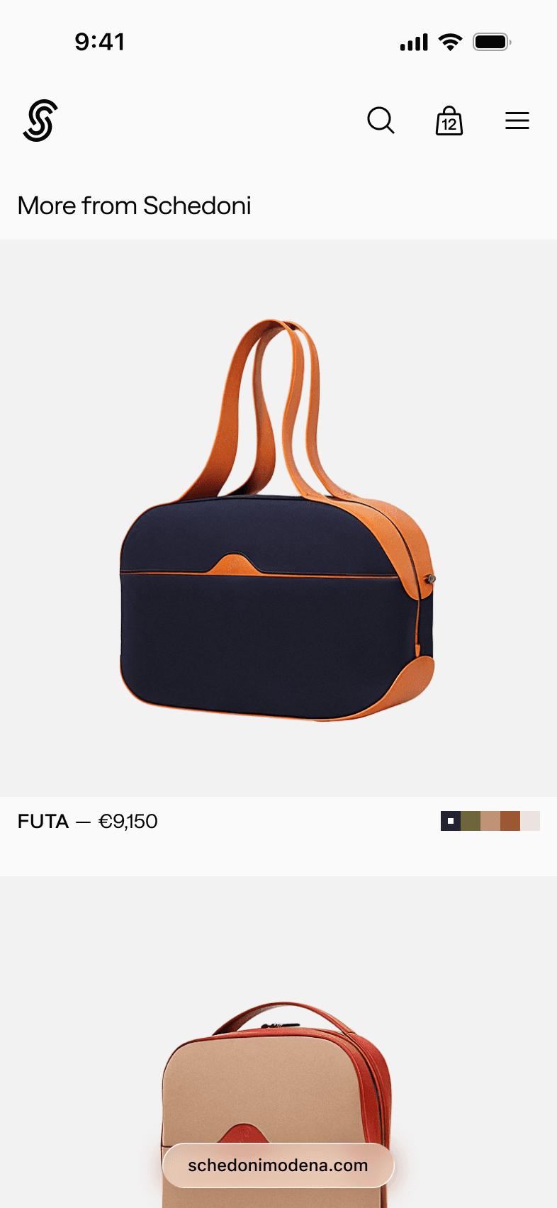


Wishlist Drawer


Bag Drawer

Our Story


Events


Account Drawer




My Account


Country & Currency Drawer


Search Drawer


Client Care

